Gave a presentation at Jolla’s 10th anniversary in Berlin, looking back at the 2021 developments, and presenting some of the upcoming features planned for the near future.
Sailfish Platform UI Development
Gave guest lecture about UI platform development at Aalto University.
Case Study: Sailfish Watch
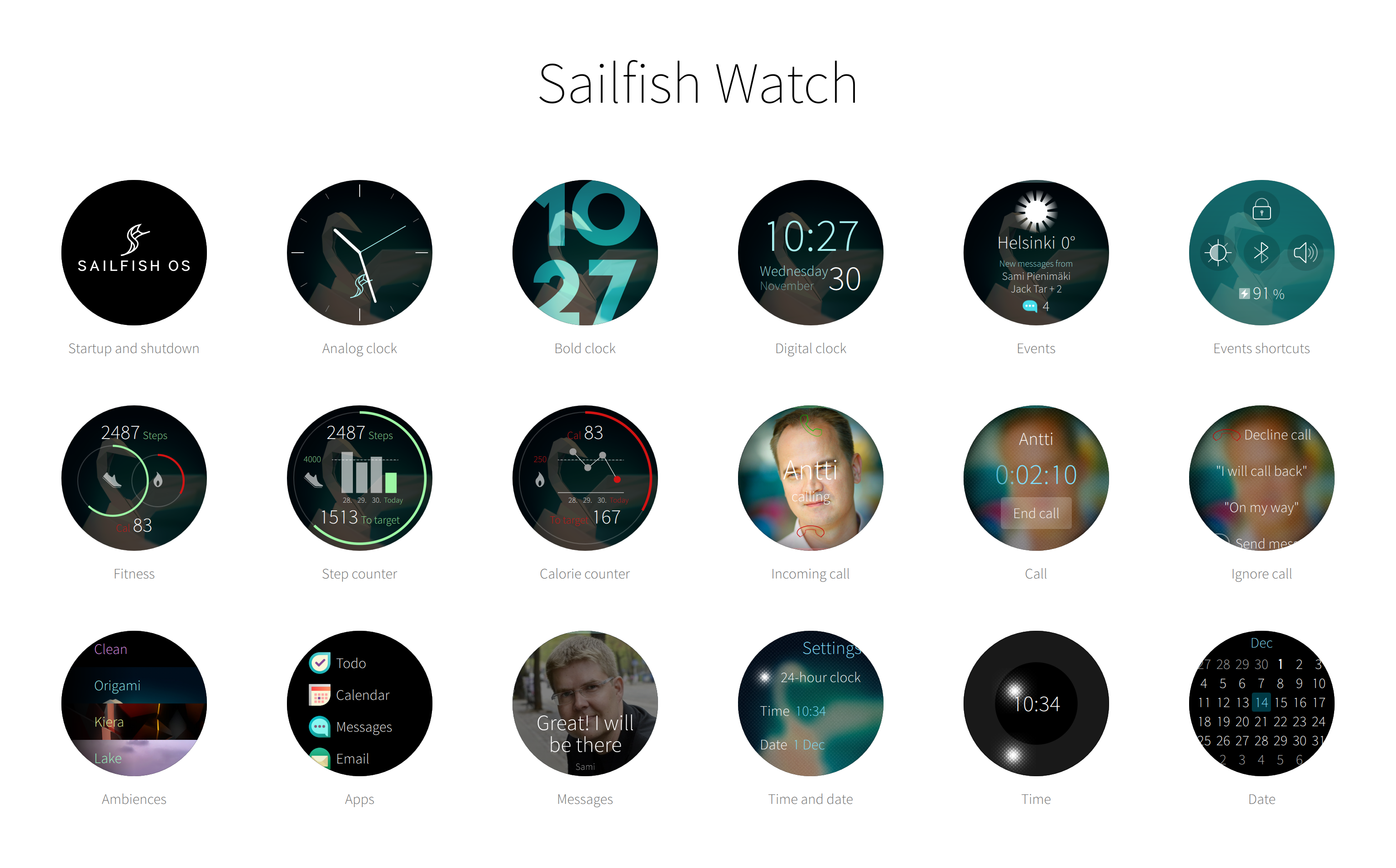
Built a working smartwatch prototype with couple of colleagues. Read more in the official blog entry.
I love Qt Quick, and yet…
I love Qt Quick. So much so that I probably cannot evaluate it very objectively. Qt Quick UI toolkit was great when it initially came out in 2010, and while lately there has been renewed focus on improving the toolkit, ultimately the core offering hasn’t evolved much in recent years. After Digia purchased Qt seems that the focus shifted back to its multi-platform roots, focusing on covering more OS ground instead of making substantial improvements to the toolkit’s capabilities. Which is a shame since Qt Quick has a lot of untapped potential. It is already a solid choice for device makers looking for a versatile embedded graphic environment. Qt wants to be a desirable cross-platform framework for companies making mobile and desktop applications, but as far as I know not that many top 100 App Store or Google Play applications are running Qt Quick. Also it never became easy enough to be widely adopted by the designers. There are still too many hoops to jump if you are not familiar with the underlying Qt framework.
I wish Qt Quick was easier for beginners, and could even work as a visual sketchbook for the students and artists playing around with interactive graphics and learning programming. I wish there were more innovative spearhead projects built with Qt. I wish Qt Quick had a demo reel that surpassed the ones from Kanzi UI, Open Frameworks, Processing, even the old TAT Cascades. I wish Qt had a lively innovation ecosystem swarming with hackers, tinkerers and designers not afraid to challenge the status quo.
In the last few years Qt Declarative module has seen improvements in QML language, graphics architecture and performance in expense of progress in Qt Quick itself and the overall UI development experience. This is unfortunate, and to me feels like many design prototyping tools like Processing, Zing Studio and Noodl hold more innovation potential, and better glimpse of what the future of UI development will be like.
The first step to reinvigorate ecosystem is to lower the barriers of innovation. Things that are easy to do have a potential to become available in abundance. To excel in UX and product building Qt needs seamless live design and coding environments, more visual primitives, better typography, grow Qt Quick Controls into a comprehensive UX pattern toolkit, lower performance footprint, better touch handling and models architecture.
Low-level components
Qt Quick Controls project provides basic components for creating user interfaces. Unfortunately basic components are not enough, to better empower application developers the whole abstraction level needs to be raised one step higher. Application developers don’t struggle with simple components like buttons and menus, they struggle integrating complex components like Web, Map, Video and Camera elements (both plain and chromed) into their apps and constructing comprehensive UX patterns spanning multiple views: for example how to implement a end-to-end sign in flow with all the bells and whistles that go with good UX, how to implement proper empty state handling and in-app tutorials for the application, how should a new feature be introduced and advertised to the user, how to combine different patterns like search and multi-selection in one coherent view, how to implement error handling across the application in a cross-platform manner, and so on.
Slow to iterate
Modify, deploy and run cycle of Qt apps could be greatly improved. Announcement of QML Live reloader environment sounds promising, but it is still quite far from web browser development tools that allow real-time property tuning, and various hover-on visualisations on top of the layouts and code. Prototyping tools like Noodl and Zing naturally go even further.
Large footprint
I was happy to read about Qt Lite project. Qt can be resource hungry. Last time I checked an empty Qt Quick process took around 10MB of dirty memory, a real application that imports different modules multiplies of that. QML Compiler helps a bit, but in general there is just too much cruft that gets loaded by the framework. You cannot start a Qt application quickly without boosters that pre-load a stub process in memory before the actual launch happens. And you cannot use boosters without OS-level support so cross-platform Qt apps running on iOS and Android are out of luck.
Unintuitive touch
Give a toddler an iPad and she can immediately interact with it. Give a toddler a Qt embedded device and she starts to struggle. The whole user interfaces freezes when she enthusiastically holds the screen with multiple fingers, because Qt cannot normally handle multiple simultaneous touch actions at a time. Even a tiny slice of thumb accidentally touching a screen edge renders all the buttons on the screen disabled. Qt multi-touch handling in general lacks finesse, pinch area often jumps the zoomed content abruptly around the viewport when faced with slimy toddler fingers, far from the graceful degradation of iOS physics. Touch thresholds, velocity and deceleration parameters don’t automatically follow display DPI, making touch interactions like flicking, taps and long-presses pain if the embedded device developer hasn’t realised he needs to tune the parameters himself for each supported display. Writing custom touch gestures and physics is pain as each Qt Quick touch element (Flickable, ListView, PathView, MouseArea, and so on) implementation comes with it’s own subtle differences in the event filtering heuristics. In practice you need to understand the Qt Quick touch event propagation in detail and be prepared to make fixes to your custom touch elements whenever you migrate to newer Qt releases.
Missing primitives
Qt Quick needs more visual primitives. Original Qt Quick 1 provided only a handful of visual primitives like Text element for laying out paragraphs, Rectangle element for creating simple color overlays and borders, and couple different Image elements for rendering bitmap graphics. With these three type of primitives you can compose most applications, but they are not enough if you want to aim higher. Qt Quick 1 was deliberately limited to the few primitives that the old QPainter architecture was able to render in acceptable framerates, but that limitation is no longer valid for Qt Quick 2. Qt demos and examples often pale in comparison to elegant Processing infographics, lively Open Frameworks interactive art projects, ingenious Noodl UI demos, flashy if a bit tacky Kanzi UI 3D interfaces and the smoothness of Berry Forest game built with Zing Studio.
For example efficient line and bezier curve primitives are needed for visualising routes, implementing hand-writing input and other connected graphs. Different kinds of radial and linear gradients are missing that are commonly used for shadows, backgrounds, borders and making emphasis around the interface. Blurs of different caliber, both fast and slower high quality ones are needed for defocusing secondary objects and for creating modern, airy, transparent feel. Masks are needed for forming non-linear shapes, creating fading masks, looking-glass-style widgets and other viewport effects. Qt Quick can draw simple circles, but new API is needed for creating sectors for pie charts and menus, clock and time picker components, progress and busy circles and so on.
A lot of different custom primitives can already be created with shaders, but not everybody is comfortable writing GLSL code, and coming up with a correct, portable and efficient shader implementation is not always an easy task. Canvas API provides many primitives that are missing in Qt Quick, but it is not efficient enough for complex visualisation tasks, and the API is not declarative like the rest of Qt Quick. Qt does include Qt Graphical Effects module, but it feels more like a collection of examples than a productised set of components hardened for real-world scenarios.
Layout limitations
While Qt Quick views and positioners provide a lot flexibility, they fall short in couple areas.
For example Qt lacks proper grid flow layout. Pinterest popularised dynamically stacking grid layout, which frees the grid items from a rigid table structure. Stacking layouts allow increasing the size of important items or reserving different amount of space for different type of content. Qt Quick does have different grid elements, but they all fail in one way or another: GridView enforces constant item size, and Flow and GridLayout elements only allow limited variation, and do the stacking differently to Pinterest.
Qt Quick views like PathView and ListView only create visual delegates for model items that are currently visible on the viewport, which is cool since it allows the views to handle large number of items without sacrificing the loading performance and memory consumption of the app. Unfortunately the dynamic loading is only supported for one model per flickable viewport, which is not enough for modern apps that often mash up information from multiple sources. For example a web store landing page could show three sections: editor’s choices, most recently added content and content recommended for the user based on earlier purchases. We need positioners that are aware of the viewport, but just adding maximumCount property to Repeater to limit the amount of items that get created would help.
Black box typography
Qt Quick offers blackbox-style font APIs with limited ability to affect the layouting paths and no way to animate the text layout changes. This is unfortunate since typography is core part of the overall experience, user interfaces are often primarily made of text. Ability to animate text layout changes in particular would be welcome addition to allow replacing abrupt visual jumps with smooth, graceful transitions.
Positioning text elements alone leaves a lot to be desired. Vertical anchor lines (baseline, mean line) within the text are often as important if not more important than anchor lines around the outer bounding box of the text element. Qt Quick does provide baseline anchors, but oddly only for the the first line of text. In effect implementing a layout created by the designers often requires calculating the exact positions explicitly. Fortunately the new FontMetrics QML element introduced in Qt 5.4 makes such calculations easier, but ideally there would be appropriate anchors also available. Other typography issues include clumsy line height and spacing APIs, issues with the text fitting behavior, and no way to increase touch areas of the links embedded within text element.
Improving text layouting is hard. Text elements are arguably the most complex components rendered on the user interface. Whenever somebody adds a new feature in Qt text layout code half-dozen hard-to-find regressions pop up in text alignment, text truncation, word wrapping, bi-directional layouts, pre-edit handling, Thai spacing rules, and so on. Developers are understandably afraid of making changes in the layouts. Still fear should not dictate development priorities.
Lack of color management
Qt Quick lacks proper color management system. In cross-platform environment the color management is often left for the underlying platform like Windows, but as far as I know in Qt embedded space there are currently no good solutions available. KDE has some color management support, but it requires changes to the graphical applications. Color corrections are often done in GPU, so don’t expect your custom shader code to be automatically color-corrected even if the underlying OS would support color management. Color management system allows calibrating the color representation of the interface between various displays. Without it orange color on one display may look yellowish on another, blue color tilt to green, and so on. Gradients that look even on one device may look flat on other, or produce banding artefacts making the graphics look clumsy and unpolished. Good color production is not only important for visual quality, lack of contrast also hampers the overall legibility of the interface. Also, coloring is often used for indication and highlighting, which falls short if the user fails to detect the difference between the colors.
Tricky models
Making good Qt models is hard. So much so that many Qt models in production are plainly broken, and fail even the simplest CRUD-style tests, just barely serving the limited use cases (like exposing few urls from a SQL database) that the original author envisioned. Some models can only handle couple of thousand data points before the application performance is sacrificed, in some the index handling is swarming with off-by-one errors and for many memory footprint naively grows in proportion with the number of data points. Updates to the model often freeze the main application thread for hundreds of milliseconds due to inefficient way of handling the changes. Developers often load the whole database table in the constructor no matter how much data there is, and reset the whole model or rewrite the whole database to disk even when only few data points are modified. Adding threading support of course introduces another category of things that can go wrong.
There are ways to make good Qt models, but QAbstractListModel provides little support so most Qt beginners fail miserably. While a major source of problems unfortunately there hasn’t been a lot of activity to improve the Qt models architecture.
Sailfish OS workshop: UI Development
Gave short twenty minute live coding presentation on Sailfish OS UI development at International Sailfish Community Event 2016.
Material:
Theme cheat sheet
Silica cheat sheet
Icon reference
Example code
Road to Sailfish OS 2.0
Responsive Layouts
A layout provides visual structure for the presented information and user interface controls that allow user to navigate and modify the information. Layout principles in digital media are derived from traditional printing media. Users don’t read but scan information. They expect most recent and critical information to be located close to the top-left corner of the view. Important information and actions are often granted a bit more space on the display. Margins are used to improve readability by creating clear visual groups. Spacing between the items in groups should generally be less than the size of individual items to communicate relation. Alignment is another way to create visual groups, for example vertical items that align horizontally form a list. Lack of alignment leads to unorganised look and takes focus way from the presented information. In most cases soft strategies like thoughtful use of margins and alignment provides enough visual structure for the layouts, reducing the need for explicit borders and backgrounds.
Widgets aligned on a layout grid
Good layouts are designed for a specific device form factor. For example on mobile devices it is often good idea to display the most common actions close to the bottom edge of the display for easy access. If you design the interface for one-handed use also take the reach of the thumb into account. Most people are right-handed making bottom-right corner of the display easiest to reach, though too much right-handed focus can make the interface cumbersome for the left-handed people. Some user interfaces allow mirroring of the controls for left-handed users.
Layouts are commonly based on only a handful of global geometry values with larger values being multiples of the smaller ones to guarantee nice alignment and grouping of the content within an invisible grid structure. Each visual item is assigned a rectangle bounding box within the grid. A good layouting system allows developers to visualise the layout grid and item borders to make debugging of alignment issues easier.
Most views are made of some kind of list or grid layouts. This is not surprising, rectangular shapes and linear stacking is optimal for flat display surfaces, leads to even margins between the items and allows the content to align nicely with the surrounding display edges. Non-linear layouts with curved paths can be used for more striking effect, but are rarely appropriate for everyday interfaces where usability trumps the more flashy qualities.
Layout direction
Content usually flows from left-to-right and top-to-bottom direction with spacing used to group the information in more manageable visual categories. On closer inspection most layouts turn out to be some kind of paths with visual items ordered along the line, for example a list layout follows a straight line whereas a grid layout produces a zigzagging line. An appropriate layout direction depends on the use case.
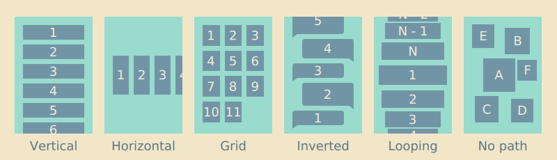 Different layouting paths
Most writing systems in the world follow left-to-right direction, and so do most layouts. Historically some frameworks have supported mirroring of layouts, but the right-to-left layouting and alignment is increasingly being limited to bi-directional text paragraphs containing right-to-left scripts like Arabic and Hebrew. Many people that read right-to-left scripts are bilingual and due to historical Western dominance in technology have been exposed to Western products long enough to prefer left-to-right positioning of items, for example to expect the number grid layout introduced by analog telephones.
Similarly people expect lists to be ordered in top-to-bottom order with the latest item appearing on top, but there are some exceptions like conversation bubbles and command-line terminals where the content is stacked in reverse bottom-to-top order with the latest item appearing last. Some layouts like tag clouds and other particle layouts don’t order items on any particular path.
Scaling layouts
Responsive layouts are optimised for multiple different display dimensions. Creating a layout that looks and behaves well on multiple displays is a challenging task. Mobile layouts are often quite cramped due to limited physical display space conflicting with the minimum size constrains needed to keep the text readable and touch targets finger-touch friendly. Larger displays can relax the layouts a bit, show more content and better utilize empty space to guide user’s eye.
There are as many scaling strategies as there are user interface frameworks. Traditionally desktop interfaces have just stretched the interface elements to the available resolution, displaying more information on high density displays, but in the process often sacrificing readability and usability of the interface. In contrast resolution independent layouts scale visual items like graphics and text uniformly to the target pixel resolution, more or less also preserving different user experience attributes as long as the physical display dimensions and other physical aspects of the device remain close enough to the original. Often good results require layouts purposely designed and adapted for each device or device category: desktop, tablets, smartphones, smartwatches, digital televisions, car infotainment systems, gaming consoles and so on.
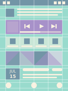
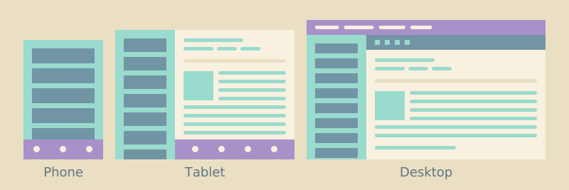 Inbox layout on different devices
Ideally the layouts are not only stretched to the available dimensions, but the whole interface is rethought around the strengths and weaknesses of the target device. Every new variant adds to the total complexity of the software project, so in practice many implementations are compromises between optimal usability and maintainability of the project. For example multi-column layouts on big screens are often collapsed to a simple one-column layout on smaller mobile devices instead of forcing content producers to maintain two different presentations. Landscape layouts often follow horizontal split view design, where the extra horizontal space is used to display two content views side-by-side. For example a landscape email application could simultaneously show your inbox and the currently selected mail.
Layout negotiations
Responsive layouts avoid hard-coding dimensions, but instead derive the final layout from different constraints dictated by the target display, platform style and presented content. Well-defined layouts do not easily break when modifying one aspect of the layout like the used font, icon dimensions, margins, number of rows or columns, and so on.
Like discussed in the previous chapter, each view is made of a hierarchy of items. Layout negotations are traversed both from top-down and bottom-up the item hierarchy. Since most views are scrolled vertically and the layouts grow down, the width of items is often dictated by the parent chain where as the height of items is often defined by the visual child items. For example the width of a label often follows the width of its container, just leaving some margins around the label. In contrast the height of a list layout is not defined by its container, but instead calculated from the sum of its child items and possible spacing between the items. Similarly the list item height is calculated by summing up the bounding box height of the visible child items and vertical padding around the bounding box. This allows the list layout to automatically correct itself when the content or margins change.
Each visual child item and container should have sane implicit dimensions, that is specify non-null width and height. Unless explicitly defined image element should follow the size of the image it displays, text element follows the bounding rectangle that fits the text it renders, and so on. Similarly layout and other container items should implicitly follow dimensions of a bounding box that fits their visible child items. Explicit width and height calculations are one of the most common sources of layout breakages, when the assumptions made in the calculation only apply locally, causing issues like overlapping items and haphazard margins elsewhere.
A layout can roughly be thought as a composition of pictures, icons, text paragraphs and user interface labels. Pictures are normally shown as thumbnails scaled to specified size or in full screen scaled to display dimensions. Like thumbnails icons normally follow predefined dimensions optimized for the target display density. Compared to images text is trickier to layout, as the space it requires depends on the used font and the length of the text. Always define width of the text element to avoid overflowing the text outside the view. Whenever you compose a new layout remember to check how it behaves with different length strings. Text paragraphs can be truncated as long as there is some way to access the text in full. Similarly pictures can be clipped in thumbnail presentation as long as there is some way to view the picture in full. In contrast user interface labels should always be displayed in full, any truncation risks losing the meaning of the label.
Composing Views
Most applications are made of multiple views, with each view playing a particular role in the design. Simple applications like calculators can have only one view, whereas more complex applications like system settings often contain dozens of views. On mobile the views are generally displayed in full screen, on desktop within a window and on browser inside the browser tabs. Each view can be presented as a hierarchical tree structure with top-level parent items often acting as containers for the visible items. Simple containers just provide normalised co-ordinate system for the child items, more complex ones also functionality like scrolling, clipping and layouting of the child items. Child items inherit many other properties through the parent chain like the visibility, opacity, scale and rotation.
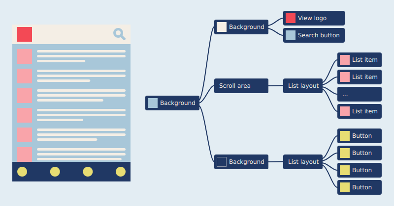
A view and its simplified tree presentation
Ideally each node in the tree has one clear responsibility to make reasoning with the code easier, but also deep tree structures should be avoided to avoid making the structure too complex to comprehend by the others. Simple item structures are also in general faster to load by the system. Coming up with a good compromise between item and structure complexity can be difficult and the ideal responsibility division often depends on the use case.
Components
Most views are split into smaller components each responsible for a specific part of the view, to encapsulate part of the presentation and logic from other parts of the view. Components can be reused between different views to avoid code duplication, enforce consistency and help keep the software project maintainable. Like views each component hides within itself a tree of functional and visual items. For example a button component could be made of two images showing a button background and an icon, a text element displaying a label, a list layout positioning the icon and label inside the component, and an invisible touch area responsible for reacting to user presses.

A button component and its tree presentation
Components vary a lot in complexity. Large components like dialogs are often composed of smaller components like buttons and input fields. Some components have a lot of hidden states, for example a modest-looking input field component can be armed with scroll areas, scroll indicators, placeholder labels, copy and paste controls, magnifiers and text prediction popups in addition to the visible editing field that is normally shown.
Navigation and content
User interfaces are roughly made from two kinds of views: navigation and content views. Navigation views are mainly used to browse content, whereas content views are used to view and edit the content. Content views should present the content in full and provide all the relevant actions user can perform to the content. In contrast navigation views are optimised for presenting multiple items at once, offer more limited set of actions and often preview content in a downscaled, truncated format.
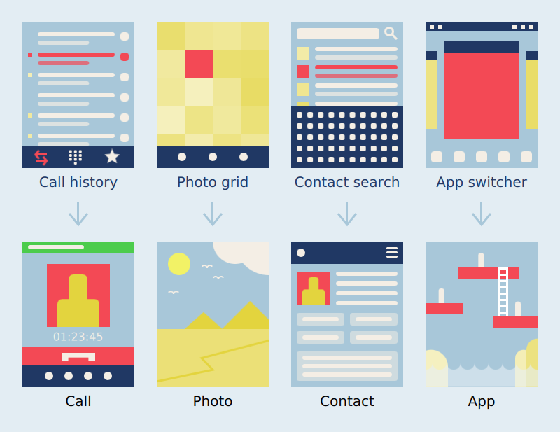
Navigation views and the respective content views
Navigation views display items stacked on vertical or horizontal lists, grids, flows or non-linear paths with visually rich content items like media, photos and album covers reserving more display space, and simple items like phone call log entries or contacts taking less space. Navigation can be made easier by allowing user to manually favorite or save the most common entries, by tagging or grouping entries into folders, by automatically collecting history of recently accessed items, providing content-specific navigation tools like timeline views or alphabetic scrollbars, or by implementing search functionality. Search and different sorting options become increasingly important when number of content items grows. Most applications provide multiple different strategies for locating the content.
Actual content items like photos, videos, maps, web pages and documents are normally viewed in full-screen mode to maximise the viewing pleasure with semi-transparent controls appearing on top when needed. Portrait aspect ratio is ideal for one-handed usage and mobility, and for reading long paragraphs of text. Landscape is appropriate when full attention and both hands are needed, for example when viewing pictures and video, playing games or typing longer messages.
View assets
Views are composed of two kinds of assets: predefined UI assets and user content. Predefined UI assets include icons, labels, fonts, backgrounds and graphical effects that make up the user interface. User content includes photos, videos, notes, messages and other documents user has stored on the device or downloads from the cloud. Most UI assets are fixed and defined by the application or the underlying platform. Embedding user content in the user interface requires much more care, the content can come in different formats, vary in size, encoding and aspect ratio, contain different metadata, embed other content types within the format, be corrupted or in the worst case contain viruses. Most UI assets are already be optimized for the presentation and only require light presentation logic, whereas user content presentation needs to handle different content variations gracefully.
Shared building blocks
Normal application developer should be able to create well-behaving applications by following platform user interface guidelines and composing the application views using common platform UI components. Platform UI components encapsulate the recommended platform style and behavior behind well-defined component APIs. An application can be pictured as a connected graph of UI patterns with each pattern solving a specific problem like how to navigate to a specific content item, scroll between paragraphs, input data, login to a service, multi-select items, delete an item, indicate an error, and so on. Platform UI components and guidelines should cover all the necessary patterns required for implementing non-trivial applications, provide clear examples how to adapt each pattern in your application and how to handle transitions between the patterns. Unfortunately no platform documentation covers everything, often the best way to determine how a use case should work is to investigate how similar use cases have been implemented in other applications.
Custom components
Building custom UI components that replace the respective platform-style components can be fun, but in practice resulting behavioral differences often end up confusing the user. Custom controls and behaviors are justified when they provide clearly better experience, you want tailor components to match your company’s style or when no existing platform pattern suits your needs. More custom controls and behaviors your application has more knowledgeable you need to be about the overall platform interaction principles to maintain the consistency of the experience. Reverse engineered implementations often fall sort in difficult areas like input validation and error handling, gesture dynamics, regional support and scalability to different device form factors.
How to Build Beautiful User Interfaces
Last spring marked 10 years of working in the mobile industry for me. During that time I have participated in building user interfaces and frameworks in quite a few different programming languages and operating systems for many different mobile devices and products in Nokia and Jolla. For almost as long I have been jotting down notes about the craft, with the intent of some day using the material as a basis of a book. Most books about user interfaces are either written by engineers targeting specific programming languages and frameworks with limited understanding of design concerns, or written by designers lacking credible technical backbone and understanding of how to realise the designs they present. Most interesting things happen at the intersection of disciplines, my aim is to write a book that merges the two fields in one seamless, coherent body of work.
The road to the finish is long. Currently I have only about thirty pages worth of miscellaneous notes that when cleaned up and written properly would probably fill around hundred pages. With some more research, competitor studies, examples, graphs and other visualizations the book probably grows even longer, though I hope to keep the book short to avoid writing that presents the valuable information in the first chapters and then goes on to artificially stretch the subject hundreds of pages more. The initial writing on the blog will be quite informal, and skip the more tedious parts like proper references. I plan to write about layouts, scalability, visual design, fluid transitions, navigation, touch interaction, context-sensitivity, data visualisation, typography, text input, regional support, tooling, architecture, performance, work flow, quality, education and future.
You can follow my progress by subscribing to the blog feed or by following me on Twitter.
What is a user interface
User interfaces provide abstractions needed for navigating to, consuming, capturing and creating content, communicating with other people, and configuring the device and services for the use. Interfaces actively predict user behavior to reduce the need for explicit effort, guide the user from accomplishing one task to another, and finally notify user of events and messages. User interfaces generally rely on displays for presenting visual data like pictures or text, on speakers for playing music and sound notifications, and to a limited extent on vibras and piezos for haptic feedback. Input devices like touch displays and physical buttons are used for navigating within the user interface, for editing content and typing in new data, devices like cameras and microphones for capturing new content, also there is a growing plethora of other sensors for sensing the surrounding environment.
Hygiene
An ability to build fast, reliable, responsive and pixel-perfect user interfaces is a big competitive advantage to any serious product company. Beautiful and effortless products create emotional attachment. Beauty comes from attention to detail and understanding what the users need. Unfortunately beauty is rare, the world is filled with clumsy and awkward user interfaces, where functionality, business realities and pressing deadlines have trumped the less tangible values. Thankfully a revolution is brewing: a tidal wave of popular online services, smartphones, apps and AAA game titles have pushed up hygiene, the level of quality people expect from software. The world is increasingly digital, and even relatively mundane consumer products like toll payment systems, electronic tax return forms and work time sheets are now being benchmarked against the best software from the industry behemoths like Apple and Google.
Psychology
Good user interface design is closer to the study of behavior (cognition, perception, learning and memory) than art, we have more things in common with other people than we often would like to admit. More and more of the principles we derive from behavioral studies are supported by empirical biological, physiological and genetic data. Even the aesthetics have their roots in psychology and science: we are attracted by clean, simple, symmetrical, natural and familiar objects. Pursuing universal qualities is also important since the user base of an product is rarely culturally, sexually or age-wise homogenic. We appreciate user interfaces that allow us to do correct, predictable and complete actions and that do not cause negative feelings. A delightful user interface surprises us in a positive way, for example by exceeding our expectations or by challenging our previous thought patterns in a creative way.
Craftsmanship
While user interface design is rooted in sciences the big part of the craft is simply engineering: the art of building things. User interface project needs people who can draw good-looking vector icons and other graphical assets, assemble balanced layouts, program correct behaviors, chart a complete experience loop, present the data appropriately on the view, connect the states together with smooth transitions and bring all the pieces together with the given hardware, software, data, social and economical constraints. The ability to build things fast is critical: more prototypes you have time to build in a given time and resources the better the end experience will be. To become fast at building interfaces you need to be familiar with the state of the art, use the best tools and techniques available, and what is most important, practice by building a lot of interfaces. You need to be familiar with the designs and hardware the competitor products are based on, and libraries and architectures they have been built with. Achieving excellence alone is very difficult, the fastest way to reach the top is to join an established expert team, and expose yourself to a lot of peer review.
Interconnected system
User interface is the user-facing, top-most layer of an complex technical system. Overall reliability of the interface is bound by the quality of the underlying hardware, middleware libraries and database systems. If the input data is bad or incompatible with the design intent no amount of data massaging will make the presentation great. Similarly no amount of compensation in software will make poor hardware like a low contrast ghosting display perform well. All parts that make up the experience are interconnected, every team member working on the product needs to care about the user experience regardless of their speciality domain and commit to the overall design goals. Exposing unknowns and detecting the pain points that prohibit you from building good user experience as early as possible is critical for the success of the project. Prototyping different aspects of the product and organising short empirical UX studies throughout the product development cycle are good ways to validate the assumptions.
What makes interface beautiful?
Desirable and beautiful products create aesthetic engagement and enhance user commitment to the brand. A beautiful user interface is composed of many overlapping and interviewing stories and metaphors user can easily relate to. A beautiful interface also needs to be fast and responsive so user doesn’t have to wait. The provided actions should behave predictably and reliably to enforce trust and learning. A beautiful user interface is forgiving and has a friendly tone of voice. The style should be calm and clean to bring the functionality and content to the foreground of the experience, though in some domains like games the overall style can be stronger and the interface play a bigger part of the experience. A beautiful user interface should, of course, also be beautiful to look at, which requires good visual taste from it’s authors that comes from visual thinking, design knowledge and experience of building products.
How to Be a Programmer
Learning to program is a lot like learning a foreign language. To be any good in it, you need to read a lot of other people’s code and write a lot of new code. Getting fluent in programming takes time, but like any practice reading somebody else’s code becomes easier the more you do it, and the more you write the faster you are able to produce working functionality and less mistakes you will make while writing. Young developers joining the industry often start their careers by maintaining existing software and end up writing fairly little new code, which is a real shame as that means it takes them awfully long to get productive and confident enough to trust their own thinking.
Like writers, many programmers suffer from writer’s block. Only solution I know to procrastination is to just start producing something and forget for a moment any quality requirements you might mentally have that prohibit you from proceeding. Contrary to popular belief writing new code isn’t dangerous. Shipping new code that hasn’t been thoroughly reviewed and tested is dangerous. In publishing, on average fairly few pages ever written end up being published and pages that are lucky enough to get published often go trough multiple revisions before being accepted by the publisher. Publishers appoint editors to review even the most accomplished authors. In software projects code reviews are rarely practiced in the required depth, even though it is one of the best empirically-proven methods of improving the code quality and catching bugs.
Words
Words are powerful. Every word is an abstraction, for example when you say a word dog people think of an idea of a dog, not necessarily any particular dog. Like words in a book, each program is described using abstractions. Natural language writer often assumes that the reader is already familiar with the used vocabulary or can infer the meaning through the context, where as in programming the author needs to explicitly define the meaning behind each words. The program code does not give the author much artistic freedom for interpretations or ambiguities, the system crashes if it is unable to follow the plot or track the involved subjects correctly. Dynamically typed and interpreted programming languages are often closer to natural languages and offer more expressive freedom for the authors than computationally faster, statistically typed and compiled languages.
Defining an abstraction is like writing a poem. Each abstraction tries to capture one concept or behavior similarly as a poem tries capture the essence of one feeling or a thought. Like in poems, a good abstraction is as concise as possible without making compromises to the original idea. An abstraction that tries to capture multiple responsibilities is hard to follow and maintain, similarly as words with ambiguous and hidden meanings are easily misunderstood by the participants. Like in writing, the more familiar metaphors you find for representing your abstractions, the more readable and self-explanatory your code will be.
Right abstractions are highly dependent on the problem domain. Good writing skills do not get you very far without solid understanding of the subject area you should be writing about. Big software companies often underestimate the importance of domain knowledge and end up hiring and subcontracting developers who lack understanding of the functionality they have been hired to improve. In addition to experience, finding right abstractions for the job requires active thinking. Every new abstraction adds to the overall complexity of the program, so it’s important that you understand what abstractions are really critical for implementing the program.
The Plot
A program is a very special kind of book. Traditional books can be read linearly from cover to cover, whereas code execution jumps between lines and chapters circularly based on the user input and changes in the environment the program is being run. In a way program is a book that is being read over and over again in a varying order. Writing new software is even more challenging than writing a book, because most software is simultaneously co-written by multiple authors, making it harder to achieve good cohesion and to make sure the common story and all the side plots won’t end up skewed and misrepresented when the changes are applied. This makes writing software largely a communication game between the authors. When the communication fails, manual and automatic verification tests are needed for shielding the program correctness from human mistakes.
Variations in the program behavior are called side effects. Side effects are a major cause of headache and quality problems in software development. Getting a program swarming with side effects to behave correctly is really difficult job. It is like living with an alcoholic dad suffering from mental problems, you never know what kind of mess he gets the whole family in. You should try to keep the number of program states at minimum and make the states you absolutely can’t live without explicit so they are easier to track and validate.
Libraries
A programmer can utilize programs written by other authors. Programs used by other programs are normally referred to as libraries. Each library provides a set of ready-made abstractions that can be used for writing solutions in a particular problem domain. Including a new library is like going to a school and learning a new skill that you can apply from now on. Using existing software libraries can speed up the development time considerably, but it also makes you dependent on the work and services of others. When problems arise it’s far more difficult to fix flaws in external libraries than in your own code.
A programmer includes libraries to the program similarly how a researcher makes citations to existing publications and uses the abstractions defined in the publications as words to define her own theories. Like researchers, professional programmers should be aware of the important software libraries in their field and be able to apply them flexibly when solving problems. Releasing your program under open source license contributes the program to the knowledge base of the whole industry similarly to how scientific publications contribute to the knowledge base of the entire field.
Powerful and accurate abstractions are critical tools for obtaining correct program behavior. With the right abstractions you can describe the program behavior more simply and concisely. A simple and concise program is easier to change and maintain, which is important as the ability to make rapid changes to a product gives any team a serious competitive advantage.