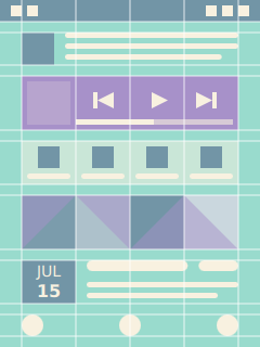
A layout provides visual structure for the presented information and user interface controls that allow user to navigate and modify the information. Layout principles in digital media are derived from traditional printing media. Users don’t read but scan information. They expect most recent and critical information to be located close to the top-left corner of the view. Important information and actions are often granted a bit more space on the display. Margins are used to improve readability by creating clear visual groups. Spacing between the items in groups should generally be less than the size of individual items to communicate relation. Alignment is another way to create visual groups, for example vertical items that align horizontally form a list. Lack of alignment leads to unorganised look and takes focus way from the presented information. In most cases soft strategies like thoughtful use of margins and alignment provides enough visual structure for the layouts, reducing the need for explicit borders and backgrounds.
Widgets aligned on a layout grid
Good layouts are designed for a specific device form factor. For example on mobile devices it is often good idea to display the most common actions close to the bottom edge of the display for easy access. If you design the interface for one-handed use also take the reach of the thumb into account. Most people are right-handed making bottom-right corner of the display easiest to reach, though too much right-handed focus can make the interface cumbersome for the left-handed people. Some user interfaces allow mirroring of the controls for left-handed users.
Layouts are commonly based on only a handful of global geometry values with larger values being multiples of the smaller ones to guarantee nice alignment and grouping of the content within an invisible grid structure. Each visual item is assigned a rectangle bounding box within the grid. A good layouting system allows developers to visualise the layout grid and item borders to make debugging of alignment issues easier.
Most views are made of some kind of list or grid layouts. This is not surprising, rectangular shapes and linear stacking is optimal for flat display surfaces, leads to even margins between the items and allows the content to align nicely with the surrounding display edges. Non-linear layouts with curved paths can be used for more striking effect, but are rarely appropriate for everyday interfaces where usability trumps the more flashy qualities.
Layout direction
Content usually flows from left-to-right and top-to-bottom direction with spacing used to group the information in more manageable visual categories. On closer inspection most layouts turn out to be some kind of paths with visual items ordered along the line, for example a list layout follows a straight line whereas a grid layout produces a zigzagging line. An appropriate layout direction depends on the use case.
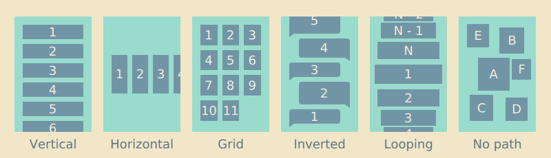 Different layouting paths
Most writing systems in the world follow left-to-right direction, and so do most layouts. Historically some frameworks have supported mirroring of layouts, but the right-to-left layouting and alignment is increasingly being limited to bi-directional text paragraphs containing right-to-left scripts like Arabic and Hebrew. Many people that read right-to-left scripts are bilingual and due to historical Western dominance in technology have been exposed to Western products long enough to prefer left-to-right positioning of items, for example to expect the number grid layout introduced by analog telephones.
Similarly people expect lists to be ordered in top-to-bottom order with the latest item appearing on top, but there are some exceptions like conversation bubbles and command-line terminals where the content is stacked in reverse bottom-to-top order with the latest item appearing last. Some layouts like tag clouds and other particle layouts don’t order items on any particular path.
Scaling layouts
Responsive layouts are optimised for multiple different display dimensions. Creating a layout that looks and behaves well on multiple displays is a challenging task. Mobile layouts are often quite cramped due to limited physical display space conflicting with the minimum size constrains needed to keep the text readable and touch targets finger-touch friendly. Larger displays can relax the layouts a bit, show more content and better utilize empty space to guide user’s eye.
There are as many scaling strategies as there are user interface frameworks. Traditionally desktop interfaces have just stretched the interface elements to the available resolution, displaying more information on high density displays, but in the process often sacrificing readability and usability of the interface. In contrast resolution independent layouts scale visual items like graphics and text uniformly to the target pixel resolution, more or less also preserving different user experience attributes as long as the physical display dimensions and other physical aspects of the device remain close enough to the original. Often good results require layouts purposely designed and adapted for each device or device category: desktop, tablets, smartphones, smartwatches, digital televisions, car infotainment systems, gaming consoles and so on.
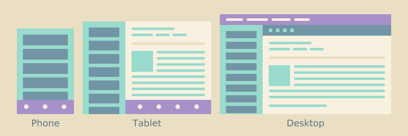 Inbox layout on different devices
Ideally the layouts are not only stretched to the available dimensions, but the whole interface is rethought around the strengths and weaknesses of the target device. Every new variant adds to the total complexity of the software project, so in practice many implementations are compromises between optimal usability and maintainability of the project. For example multi-column layouts on big screens are often collapsed to a simple one-column layout on smaller mobile devices instead of forcing content producers to maintain two different presentations. Landscape layouts often follow horizontal split view design, where the extra horizontal space is used to display two content views side-by-side. For example a landscape email application could simultaneously show your inbox and the currently selected mail.
Layout negotiations
Responsive layouts avoid hard-coding dimensions, but instead derive the final layout from different constraints dictated by the target display, platform style and presented content. Well-defined layouts do not easily break when modifying one aspect of the layout like the used font, icon dimensions, margins, number of rows or columns, and so on.
Like discussed in the previous chapter, each view is made of a hierarchy of items. Layout negotations are traversed both from top-down and bottom-up the item hierarchy. Since most views are scrolled vertically and the layouts grow down, the width of items is often dictated by the parent chain where as the height of items is often defined by the visual child items. For example the width of a label often follows the width of its container, just leaving some margins around the label. In contrast the height of a list layout is not defined by its container, but instead calculated from the sum of its child items and possible spacing between the items. Similarly the list item height is calculated by summing up the bounding box height of the visible child items and vertical padding around the bounding box. This allows the list layout to automatically correct itself when the content or margins change.
Each visual child item and container should have sane implicit dimensions, that is specify non-null width and height. Unless explicitly defined image element should follow the size of the image it displays, text element follows the bounding rectangle that fits the text it renders, and so on. Similarly layout and other container items should implicitly follow dimensions of a bounding box that fits their visible child items. Explicit width and height calculations are one of the most common sources of layout breakages, when the assumptions made in the calculation only apply locally, causing issues like overlapping items and haphazard margins elsewhere.
A layout can roughly be thought as a composition of pictures, icons, text paragraphs and user interface labels. Pictures are normally shown as thumbnails scaled to specified size or in full screen scaled to display dimensions. Like thumbnails icons normally follow predefined dimensions optimized for the target display density. Compared to images text is trickier to layout, as the space it requires depends on the used font and the length of the text. Always define width of the text element to avoid overflowing the text outside the view. Whenever you compose a new layout remember to check how it behaves with different length strings. Text paragraphs can be truncated as long as there is some way to access the text in full. Similarly pictures can be clipped in thumbnail presentation as long as there is some way to view the picture in full. In contrast user interface labels should always be displayed in full, any truncation risks losing the meaning of the label.